How my most expensive business mistake became the foundation for helping others build simple systems that actually work
The Setup: When "Professional" Meant Expensive.
Back in the early 2000s, when I was building my medical ultrasound equipment business, the digital landscape looked very different. Facebook didn't exist yet. LinkedIn was just getting started. If you wanted to look professional online, you needed a "real" website - and that meant paying serious money to serious designers.
I was spending thousands of euros on trade exhibitions across Europe, standing in crowded halls with expensive booth setups, hoping the right prospects would walk by. The ROI was terrible: €2,000 for booth space, €1,500 for travel and accommodation, €1,000 for marketing materials and setup. Multiply that by several exhibitions per year, and I was looking at €15,000+ annually for maybe 15-20 qualified leads total.
I knew there had to be a better way.
The Decision: Investing in a "Professional" Website
Everyone told me the same thing: "You need a professional website." In the medical equipment industry, credibility was everything. Doctors and hospital administrators weren't going to buy expensive diagnostic equipment from someone who looked amateur online.
So I did what every "smart" business owner does - I hired what I thought was the best. A professional web design agency in Switzerland quoted me 6,000 Swiss francs (approximately €6,500 in today's money) for a complete website solution.
The price seemed reasonable for what I was getting:
- Custom design tailored to the medical industry
- Professional photography integration
- Detailed product specification pages
- "State-of-the-art" content management system
- Mobile compatibility (which was just becoming important)
- Search engine optimization
I was excited. Finally, I'd have something professional to show potential clients instead of just handing out brochures at expensive exhibitions.
The Delivery: Beautiful But Broken
Three months later, the website launched, and I was genuinely impressed. The design was clean, modern, and undeniably professional. The product photography was stunning. The technical specifications were comprehensive and well-organized. Every page looked like it belonged on a Fortune 500 company's website.
I proudly started directing prospects to the site. "Check out our website," I'd say, feeling confident that I finally had a digital presence that matched the quality of my products and services.
But then something strange started happening...
The Problem: Pretty Doesn't Equal Profitable
Within the first month, I noticed a disturbing pattern. People were visiting the website - the analytics showed good traffic from my marketing efforts. They were spending time on the product pages, reading the specifications, clearly interested in what I offered.
But nobody was contacting me.
I started digging deeper into the user experience, clicking through my own website as if I were a potential customer. That's when I discovered the fatal flaw that was costing me thousands in lost business:
Every single product page was a dead end.
Here's what I found:
- Beautiful product images ✓
- Detailed technical specifications ✓
- Professional layout and design ✓
- Clear call-to-action buttons ✗
- Easy way to request quotes ✗
- Product-specific inquiry forms ✗
The only way for an interested prospect to contact me was to:
- Navigate away from the product they were interested in
- Find the generic "Contact Us" page (buried in the main navigation)
- Fill out a basic contact form with no context about which product interested them
- Hope I would understand what they wanted and respond appropriately
The User Experience Nightmare
Let me paint you a picture of what my potential customers were experiencing:
Dr. Martinez, a cardiologist in Barcelona, needs a new ultrasound system for his practice. He finds my website through a Google search, clicks on the exact model that would be perfect for his needs, reads through all the specifications, gets excited about the features...
And then what?
There's no "Request Quote for This Model" button. No "Schedule a Demo" link. No "Get Pricing Information" option. Just a beautiful page that essentially says, "This is what we have. Good luck figuring out how to buy it."
So Dr. Martinez has to:
- Remember the specific model number
- Navigate to a separate contact page
- Fill out a generic form
- Explain in a text box what he's interested in
- Hope the person reading his inquiry connects the dots
Most people, understandably, just left. They'd find another supplier with a simpler purchasing process.
The Expensive Realization
After six months of disappointing results, I sat down and calculated the real cost of my "professional" website:
Direct costs:
- Website development: €6,500
- Lost opportunities: €15,000+ (conservative estimate based on traffic that didn't convert)
- Time spent trying to figure out why it wasn't working: 40+ hours
Opportunity costs:
- Delayed lead generation by 6+ months
- Continued reliance on expensive exhibitions
- Damaged confidence in digital marketing
Total cost of my €6,500 website: Over €20,000 in the first year alone.
The Lesson That Changed Everything
This expensive failure taught me the most valuable business lesson of my career:
Pretty doesn't equal profitable. Function trumps form every single time.
The web design agency had focused on making my website look impressive to other web designers. They'd created something that would win design awards but failed at the basic business function of converting visitors into customers.
They had confused "professional looking" with "professionally effective."
What I Learned About Real Web Design
Through this painful experience, I discovered what actually matters in business website design:
1. Every Page Should Have a Purpose
Each page should move the visitor closer to becoming a customer. If a page doesn't have a clear call-to-action, it's just expensive digital decoration.
2. Make It Ridiculously Easy to Buy
The harder you make it for people to give you money, the less money you'll make. Every product or service should have an obvious "next step" button.
3. Context Matters More Than Beauty
A simple contact form that captures which product someone is interested in is infinitely more valuable than a beautiful generic contact page.
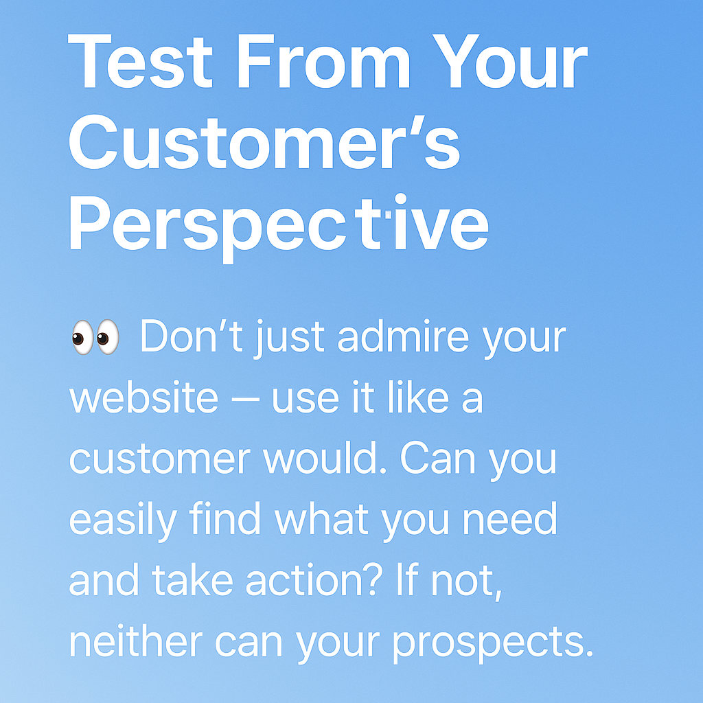
4. Test From the Customer's Perspective
Don't just admire your website - use it like a customer would. Can you easily find what you need and take action? If not, neither can your prospects.
5. Business Results Beat Design Awards
Your website's job is to grow your business, not impress other designers. Every design decision should serve that goal.
The Turnaround: Building Something That Actually Worked
Armed with these hard-learned lessons, I eventually rebuilt my online presence using a completely different approach:
- Simple, clear navigation that made sense to customers, not designers
- Product-specific inquiry buttons on every product page
- Context-aware contact forms that captured exactly what people were interested in
- Clear value propositions on every page
- Multiple ways to get in touch depending on the visitor's preference
The results were immediate and dramatic:
- 300% increase in qualified inquiries within the first month
- Higher-quality leads because people could specify exactly what they needed
- Reduced sales cycle because prospects were better informed before contacting me
- Finally, a positive ROI on my digital marketing efforts
Why I Share This Story
Today, I help other business owners avoid the same expensive mistakes I made. When I see a beautiful website with no clear calls-to-action, I remember that €6,500 lesson. When someone shows me their "professional" site that generates no leads, I know exactly what's wrong.
The web design industry hasn't changed much since my expensive education. Agencies still prioritize appearance over performance. They still build websites that impress other designers rather than convert customers.
But it doesn't have to be this way.
The Simple Systems Approach
Now, when I build websites for clients, every decision is guided by one question: "Will this help the business owner get more customers?"
- Thrive Themes instead of custom design - Built for conversion, not just aesthetics
- Clear calls-to-action on every page - Make it obvious what visitors should do next
- Simple, business-focused functionality - Everything serves a clear business purpose
- Owner-controlled systems - No ongoing dependency on developers or agencies
The result? Professional websites that actually work for €1,500 instead of €6,500+, delivered in 4 weeks instead of 4 months, with systems business owners can understand and control.
Your Takeaway: Avoid My Expensive Mistake
If you're considering a website investment, ask these questions before you spend a euro:
- Does every page have a clear call-to-action?
- Can visitors easily inquire about specific products or services?
- Is the contact process simple and contextual?
- Will I be able to make changes without hiring a developer?
- Is the focus on business results or design awards?
If the answer to any of these is "no" or "I'm not sure," you might be about to make the same €6,500 mistake I did.
Ready for a Different Approach?
If you're tired of websites that look pretty but don't work, or if you're currently stuck with just a Facebook page and know you need something more professional, let's talk.
I'll help you build simple systems that actually work - so you can focus on growing your business instead of wondering why your expensive website isn't generating leads.
Have questions about your current website or online presence? Contact me here - I'm always happy to share what I've learned from my expensive mistakes.
