How a single website design flaw cost a successful business thousands in revenue - and the simple fix that changed everything
The Business That Had Everything... Except Results
Last year, I was working with a partner who had built what seemed like the perfect online presence. Beautiful website, professional photography, detailed product descriptions, steady traffic from marketing efforts. From the outside, everything looked successful.
But there was a problem: despite having hundreds of visitors each month, the website was generating almost zero inquiries, because of one missing button
"I don't understand it," he told me during one of our calls. "People are visiting the site, they're spending time on the product pages, but nobody's contacting us. The analytics show engagement, but we're not getting business."
I offered to take a look at his website from a customer's perspective. What I discovered was a perfect example of how one small design oversight can cost a business tens of thousands of euros in lost revenue.
The Website Audit: Everything Looked Perfect, But There was One Missing Button
At first glance, his website was impressive:
- Professional design that looked credible and trustworthy
- High-quality product photography that showcased items beautifully
- Detailed specifications that answered technical questions
- Fast loading times and mobile responsiveness
- Good SEO that was driving qualified traffic
- Clear navigation that made sense to visitors
By most standards, this was a well-built website. Any web designer would have been proud to show it in their portfolio.
But I wasn't looking at it as a web designer - I was looking at it as a potential customer.
The Customer Journey: Where Everything Fell Apart
I decided to simulate the experience of someone actually trying to buy from this business. I picked a product I was genuinely interested in and followed the natural customer journey:
Step 1: Found the product ✓ The navigation was clear, and I easily located what I was looking for.
Step 2: Read the description ✓Comprehensive information that answered my questions about features and specifications.
Step 3: Viewed the images ✓Professional photography that showed the product from multiple angles.
Step 4: Decided I wanted to buy it ✓Everything looked good, the price was reasonable, and it met my needs perfectly.
Step 5: Tried to take the next step
 And here's where everything broke down...
The €50,000 Problem: No Clear Next Step, Because of One Missing Button
After spending 10 minutes reading about a product I wanted to purchase, I looked for the obvious next step: a way to inquire about buying it, request a quote, or get more information.
What I found instead:
- No "Request Quote" button
- No "Get More Information" link
- No "Contact Us About This Product" option
- No way to add it to a cart or inquiry list
- Just... nothing, one missing button
The only option was a tiny "Contact" link in the main navigation that led to a generic contact form with no context about which product I was interested in.
The User Experience Nightmare Because of One Missing button
Picture this from a customer's perspective:
You're a busy business owner who needs a specific product. You find exactly what you're looking for on a website, read all about it, decide you want to buy it... and then you have to:
- Navigate away from the product page you're interested in
- Hunt for a generic contact form
- Remember the specific product name and model number
- Explain everything from scratch in a text box
- Hope the business owner connects the dots and responds appropriately
Most people simply don't have the patience for this process. They'll find another supplier who makes it easier to give them money. All that because of one missing button!
The Math: Calculating the Real Cost
Curious about the actual impact, I dug into his website analytics:
Monthly website traffic: 2,000 visitorsProduct page views: 1,200 per monthAverage time on product pages: 3 minutes (indicating genuine interest)Contact form submissions: 2-3 per monthConversion rate: 0.2% (industry average is 2-3%)
The lost opportunity calculation:
- If just 2% of interested visitors could easily inquire (industry standard), that would be 24 inquiries per month instead of 2-3
- Average project value: €2,500
- Lost revenue per month: €50,000+ (20+ additional projects)
- Annual lost revenue: €600,000+
This one missing button was costing this business over half a million euros per year.
The Psychology Behind the One Missing button Problem
Why do businesses make this mistake? After working with dozens of companies, I've identified the common thinking patterns:
"Our Products Sell Themselves"
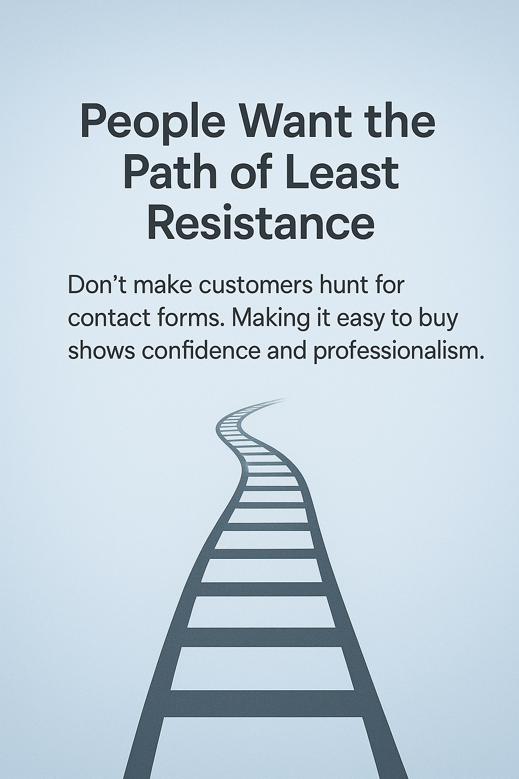
Many business owners assume that if someone wants their product, they'll figure out how to buy it. This ignores basic human psychology - people want the path of least resistance.
"We Don't Want to Look Too Sales-y"
Some businesses worry that clear calls-to-action make them look pushy or desperate. In reality, making it easy to buy shows confidence and professionalism.
"The Contact Page Should Be Enough"
Generic contact forms work for general inquiries, but they create friction for people interested in specific products or services.
"We'll Know What They Want"
Businesses often assume they can interpret vague contact form messages. But why make customers explain what they already showed interest in?
The Simple Fix That Changed Everything
The solution was embarrassingly simple. We added clear, contextual calls-to-action to every product page:
What we added:
- "Request Quote for [Product Name]" buttons on every product page
- Pre-filled contact forms that included the specific product information
- "Get More Information" options for people not ready to buy yet
- "Schedule a Demo" links for higher-value items
- "Add to Inquiry List" functionality for people comparing multiple products
The technical implementation took less than 2 hours.
The Results: Immediate and Dramatic
Within the first month after adding proper calls-to-action:
Inquiry volume: Increased from 2-3 per month to 15-20 per month
Conversion rate: Jumped from 0.2% to 1.8% (close to industry standard)
Quality of inquiries: Much higher because people specified exactly what they wantedSales cycle: Shortened because prospects were better qualified
Revenue impact: Additional €35,000 in the first month alone
The business owner was stunned: "I can't believe something so simple made such a huge difference. Why didn't anyone tell me this before?"
The Broader Lesson: Function Over Form
This experience reinforced a critical principle I learned from my own expensive website mistakes: Beautiful design means nothing if it doesn't help your business grow.
Most web designers focus on making websites look impressive. They worry about color schemes, typography, and visual hierarchy. These things matter, but they're secondary to the fundamental question: "Does this help visitors become customers?"
What Really Matters in Website Design:
1. Clear Value Proposition Visitors should understand what you offer within 5 seconds of landing on any page.
2. Obvious Next Steps Every page should have a clear, contextual call-to-action that makes sense for that specific content.
3. Reduced Friction Make it as easy as possible for people to give you money. Every extra step costs you customers.
4. Context Preservation Don't make people repeat information they've already shown interest in through their behavior.
5. Multiple Contact Options Different people prefer different ways to get in touch - accommodate various preferences.
Red Flags: Signs Your Website Has the Same Problem
Here's how to audit your own website for this costly mistake:
The 5-Minute Test:
- Pick a product or service you offer
- Navigate to that page as if you were a new visitor
- Read the information like an interested customer would
- Try to take the next step toward buying or inquiring
- Count how many clicks it takes to express interest
If it takes more than 1-2 clicks, you're losing customers.
Warning Signs:
- Generic "Contact Us" as the only option
- Contact forms that don't specify what the person is interested in
- No clear calls-to-action on product/service pages
- Visitors have to explain their interest from scratch
- Multiple steps required to express interest in something specific
Industry-Specific Examples
This problem appears across every industry, but manifests differently:
Service Providers: Beautiful portfolio pages with no "Get Quote" buttons
E-commerce: Product pages that don't clearly show how to purchase
Consultants: Service descriptions with no "Schedule Consultation" options
B2B Companies: Solution pages with no "Request Demo" functionality
Local Businesses: Service pages with no "Book Appointment" links
The pattern is always the same: great content, professional design, missing conversion elements.
The Agency Problem: Why This Keeps Happening
Why do professional web designers consistently miss this crucial element? After working with dozens of businesses who've had this problem, I've identified the root causes:
Designers Think Like Designers, Not Customers
Most web designers focus on visual appeal and technical functionality. They don't think about the business conversion process.
No Real Business Experience
Many designers have never run a business or dealt with sales processes. They don't understand how customers actually behave.
Portfolio Over Performance
Agencies want websites that look impressive in their portfolios, not necessarily websites that generate business results.
Separation of Design and Marketing
Many agencies treat web design and conversion optimization as separate services, leading to beautiful websites that don't convert.
The Simple Systems Approach
When I build websites for clients, every design decision is guided by one question: "Will this help the business owner get more customers?"
This means:
- Every service page gets a relevant call-to-action
- Every product page has clear inquiry options
- Contact forms capture context about what people are interested in
- Multiple contact methods accommodate different preferences
- Simple, obvious processes that don't require explanation
The result? Professional websites that actually generate business, not just compliments on the design.
Your Action Plan: Fix This Today
Don't wait months to address this problem. Here's what you can do immediately:
Immediate Actions (This Week):
- Audit your current website using the 5-minute test above
- Add specific calls-to-action to your most important pages
- Create contextual contact forms that capture what people are interested in
- Test the customer journey from multiple product/service pages
Ongoing Improvements (This Month):
- Monitor your analytics to see which pages get traffic but no conversions
- A/B test different call-to-action buttons to see what works best
- Ask existing customers how they prefer to get in touch
- Simplify your contact process wherever possible
Long-term Strategy:
- Regular conversion audits to identify new friction points
- Customer feedback collection about the inquiry process
- Continuous optimization based on real user behavior
- Focus on business results over design trends
Don't Make the Same €50,000 Mistake
The business owner I helped wishes someone had pointed out this problem years earlier. "Think about all the customers we lost because we made it too hard for them to buy from us," he said. "It's painful to think about."
But here's the good news: this is one of the easiest and most impactful improvements you can make to your website. Unlike complex technical changes or expensive redesigns, adding proper calls-to-action can be done quickly and will show immediate results.
Ready to Fix Your Website's Conversion Problems?
If you're wondering whether your website has similar issues, or if you're tired of getting website traffic that doesn't convert into business, let's talk.
I'll help you build simple systems that actually work - websites that look professional AND generate customers, not just compliments.
Want a quick audit of your website's conversion potential? [Contact me here] and I'll take a look at your biggest opportunities for improvement.
