After analyzing hundreds of small business websites, these conversion-killing mistakes appear everywhere - costing owners thousands in lost revenue
The Website Mistakes That Costs Businesses Thousands
Over the years, I've had the opportunity to analyze hundreds of small business websites. Some belonged to clients seeking help, others were competitors I was researching, and many were businesses I encountered while helping partners and colleagues.
What I discovered was both shocking and predictable: 95% of small business make the same three critical website mistakes.
These aren't technical errors or design flaws that require expensive fixes. They're fundamental business mistakes that kill sales every single day - and most business owners have no idea they're happening.
The worst part? Each of these mistakes is completely preventable and can be fixed in less than a day. Yet they continue to cost small businesses thousands of euros in lost revenue every month.
Why These Website Mistakes Are So Common
Before we dive into the specific mistakes, it's important to understand why they're so widespread:
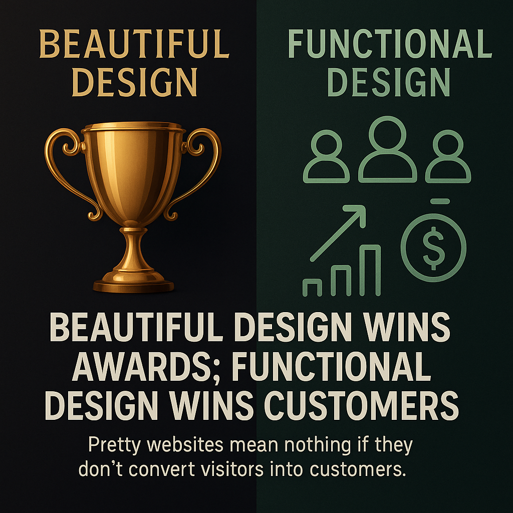
The "Pretty Website" Trap
Most business owners hire web designers who focus on making websites look impressive rather than function effectively. Beautiful design wins awards; functional design wins customers.
The "Build It and They Will Come" Mentality
Many businesses assume that having a website is enough. They don't think about the customer journey or conversion process - they just want to "have a presence online."
The Template Approach
Many websites are built using generic templates that look professional but weren't designed with specific business goals in mind. They're one-size-fits-all solutions for unique business challenges.
Lack of Business Perspective
Most web designers have never run a business or dealt with sales processes. They don't understand how customers actually behave or what motivates purchasing decisions.
Website Mistake #1: No Clear Value Proposition on the Homepage
The Problem
I can't tell you how many business websites I've visited where I genuinely couldn't figure out what the company actually does within the first 10 seconds. The homepage is filled with generic business jargon, vague statements about "excellence" and "quality," but no clear explanation of who they help and how.
Real Examples I've Encountered:
- A consulting firm whose homepage said "We provide innovative solutions for modern businesses" (What kind of solutions? For what problems?)
- A service provider with the tagline "Your partner in success" (Partner for what? Success in what area?)
- A product company that led with "Quality you can trust" (Quality of what products? For what purpose?)
Why This Kills Sales
When visitors land on your homepage, they're asking three immediate questions:
- What do you do?
- Can you help me with my specific problem?
- Why should I choose you over competitors?
If your homepage doesn't answer these questions within 5-10 seconds, visitors leave. They don't scroll down to find more information. They don't click through to other pages. They simply go to your competitor's website.
The Psychology Behind the Problem
Business owners often assume that their industry or services are obvious to everyone. They think, "Of course people know what we do - we're in the [industry] business." But your website visitors don't have your insider knowledge.
Additionally, many businesses try to appeal to everyone by being vague, thinking this will cast a wider net. In reality, it just confuses everyone.
The Fix: Crystal Clear Value Proposition
Your homepage should immediately communicate:
- Who you help (your target customer)
- What problem you solve (their pain point)
- How you solve it (your unique approach)
- What result they get (the transformation)
Example transformation:
- Before: "We provide innovative business solutions"
- After: "We help small restaurants increase profits by 30% through simple inventory management systems"
Quick Implementation Steps:
- Write a one-sentence description of who you help and how
- Test it on someone outside your industry - can they understand it immediately?
- Place it prominently at the top of your homepage
- Remove generic business jargon that doesn't add specific value
Website Mistake #2: Missing or Weak Calls-to-Action (The Most Common!)
The Problem
This is by far the most expensive website mistake I see, and it's everywhere. Beautiful websites with detailed information about products or services, but no clear way for interested visitors to take the next step.
I've seen:
- Service pages with comprehensive descriptions but no "Get Quote" button
- Product pages with detailed specifications but no "Request Information" link
- About pages that build trust but offer no way to capitalize on that trust
- Blog posts that provide value but don't guide readers toward becoming customers
The Scale of This Problem
Let me share some real numbers from businesses I've helped:
Case Study 1: Local Service Provider
- Monthly website visitors: 800
- Service page views: 400
- Contact form submissions: 2-3 per month
- Conversion rate: 0.6%
After adding clear calls-to-action to service pages:
- Same traffic: 800 visitors
- Contact form submissions: 18-22 per month
- New conversion rate: 2.5%
- Revenue increase: 400%
Case Study 2: B2B Consultant
- Monthly website visitors: 1,200
- Service page engagement: High (3+ minutes average)
- Consultation requests: 1-2 per month
- Conversion rate: 0.15%
After implementing contextual calls-to-action:
- Same traffic and engagement
- Consultation requests: 12-15 per month
- New conversion rate: 1.2%
- Revenue increase: 700%
Why Calls-to-Action Are Missing
Fear of Being "Salesy" Many business owners worry that clear calls-to-action make them look pushy or desperate. This is backwards thinking - making it easy for people to buy shows confidence and professionalism.
Assumption That People Will Figure It Out Businesses often assume that interested visitors will naturally find a way to contact them. This ignores basic human psychology - people follow the path of least resistance.
Generic "Contact Us" Mentality Many websites rely on a single, generic contact page for all inquiries. This creates friction and loses context about what visitors are specifically interested in.
The Psychology of Effective Calls-to-Action
Effective calls-to-action work because they:
- Reduce decision fatigue by making the next step obvious
- Preserve context about what the visitor is interested in
- Lower the commitment barrier by offering appropriate next steps
- Create urgency without being pushy
Types of Calls-to-Action That Work
For Service Providers:
- "Get Your Free Quote"
- "Schedule a Consultation"
- "Request a Custom Proposal"
- "Book Your Assessment"
For Product Businesses:
- "Request Product Information"
- "Get Pricing Details"
- "Schedule a Demo"
- "Download Specifications"
For Consultants:
- "Book a Strategy Call"
- "Get Your Free Analysis"
- "Schedule a Discovery Session"
- "Request a Custom Plan"
Implementation Strategy
Every Page Should Have a Purpose:
- Homepage: Primary service or main conversion goal
- Service pages: Specific to that service ("Get Quote for [Service]")
- Product pages: Specific to that product ("Request Info on [Product]")
- About page: "Work with us" or "Get started"
- Blog posts: Relevant to the topic discussed
Multiple Options for Different Commitment Levels:
- High commitment: "Buy now," "Schedule consultation"
- Medium commitment: "Get quote," "Request information"
- Low commitment: "Download guide," "Subscribe to updates"
Mistake #3: Sending Visitors Away from Your Website
The Problem
This mistake is less common but absolutely devastating when it happens. I've encountered businesses whose websites actually send interested visitors to competitor websites or third-party platforms where they lose control of the customer relationship.
Real Examples I've Discovered:
The Partner Website Disaster I worked with a business owner whose website linked directly to manufacturer websites from every product page. Visitors would click to learn more about a product and end up on the supplier's site, where they could buy directly or find other distributors.
The Social Media Trap A service provider whose website's main call-to-action was "Follow us on Facebook for updates." Instead of capturing leads on their own platform, they were sending people to a social media platform they didn't control.
The Third-Party Booking System A consultant who used a third-party booking platform that captured all the customer data and offered competing services during the booking process.
Why This Happens
Convenience Over Control Many businesses choose convenient third-party solutions without considering the long-term cost of losing customer relationships.
Lack of Understanding About Customer Journey Business owners don't realize that every time they send someone away from their website, they risk losing that potential customer forever.
Partnership Confusion Some businesses think that linking to partners or suppliers shows transparency and builds trust. While transparency is good, sending customers directly to competitors is business suicide.
The Hidden Costs
When you send visitors away from your website, you lose:
- Control over the customer experience
- Ability to capture contact information
- Opportunity to present your unique value proposition
- Data about customer behavior and preferences
- Future marketing opportunities
The Fix: Keep Visitors on Your Platform
Instead of external links, create:
- On-site contact forms for product inquiries
- Your own booking system or calendar integration
- Lead magnets that capture information before providing resources
- Internal pages that provide the information visitors need
When you must link externally:
- Open in new tabs so visitors don't leave your site
- Capture information first before providing external resources
- Follow up immediately with captured leads
The Compound Effect: When Multiple Website Mistakes Combine
The real tragedy occurs when businesses make all three website mistakes simultaneously. I've encountered websites that:
- Have unclear value propositions (visitors don't understand what they do)
- Lack clear calls-to-action (interested visitors can't take next steps)
- Send people away to competitor platforms (losing potential customers entirely)
The result: Beautiful, expensive websites that generate almost zero business.
Case Study: The €8,000 Website That Generated €0 A client came to me after spending €8,000 on a "professional" website that had generated exactly zero inquiries in six months. The site had all three problems:
- Unclear homepage that used industry jargon instead of clear benefits
- No calls-to-action on any service pages
- Links to competitor websites for "additional resources"
After fixing these three issues (total time investment: 6 hours), the website generated 12 qualified inquiries in the first month.
Industry-Specific Manifestations
These mistakes appear differently across industries but follow the same patterns:
Professional Services (Lawyers, Accountants, Consultants)
- Mistake #1: Generic "professional excellence" messaging instead of specific problem-solving
- Mistake #2: No clear way to schedule consultations or request quotes
- Mistake #3: Linking to legal databases or industry resources that lead visitors away
Local Services (Restaurants, Salons, Contractors)
- Mistake #1: Assuming everyone knows what they offer locally
- Mistake #2: No online booking or clear contact methods for specific services
- Mistake #3: Social media as primary call-to-action instead of direct booking
E-commerce and Retail
- Mistake #1: Product catalogs without clear value propositions
- Mistake #2: Product pages without clear purchase or inquiry paths
- Mistake #3: Linking to manufacturer websites or third-party retailers
B2B Companies
- Mistake #1: Technical jargon instead of business benefits
- Mistake #2: No clear path to request demos or consultations
- Mistake #3: Linking to partner sites or industry resources
The Quick Fix Framework
The good news is that all three mistakes can be fixed quickly and inexpensively:
Week 1: Fix Your Value Proposition
- Write a clear headline that explains who you help and how
- Test it on 3 people outside your industry
- Revise based on feedback until it's immediately understandable
- Update your homepage with the new messaging
Week 2: Add Clear Calls-to-Action
- Audit every page on your website
- Add relevant calls-to-action to pages that need them
- Create specific contact forms for different services/products
- Test the customer journey from visitor to inquiry
Week 3: Eliminate External Leaks
- Identify all external links on your website
- Replace with internal solutions where possible
- Capture information before providing external resources
- Ensure all links open in new tabs if they must stay
Week 4: Test and Optimize
- Monitor your analytics for improved conversion rates
- Track inquiry volume and quality
- A/B test different approaches to see what works best
- Continuously improve based on real results
The ROI of Fixing These Website Mistakes
Based on businesses I've helped fix these issues:
Average improvement in conversion rates: 300-500%Typical timeline to see results: 2-4 weeksAverage cost to implement fixes: €500-€1,500Average additional monthly revenue: €3,000-€15,000
Return on investment: Usually 300-1000% within the first year
Red Flags: Signs Your Website Has These Problems
Quick Self-Assessment:
- Can a stranger understand what you do within 10 seconds of visiting your homepage?
- Does every service/product page have a clear next step for interested visitors?
- Do all your links keep visitors on your website or capture their information first?
If you answered "no" to any of these questions, you're likely losing customers every day.
Analytics Warning Signs:
- High bounce rates on key pages (above 70%)
- Low conversion rates from traffic to inquiries (below 2%)
- High traffic but low inquiry volume
- Visitors spending time on pages but not taking action
Why Agencies Don't Fix These Problems
You might wonder why professional web designers consistently miss these crucial business elements:
Different Priorities
- Agencies focus on: Visual design, technical functionality, portfolio pieces
- Business owners need: Lead generation, customer conversion, revenue growth
Lack of Business Experience
Many web designers have never run a business or dealt with sales processes. They don't understand the customer journey from visitor to customer.
Separation of Services
Many agencies treat web design and conversion optimization as separate services, leading to beautiful websites that don't generate business.
The Simple Systems Approach
When I build websites for clients, I start with business goals, not design preferences:
- Who are your ideal customers?
- What problems do you solve for them?
- What's the natural next step for interested visitors?
- How can we make that step as easy as possible?
Only after answering these questions do we worry about colors, fonts, and visual design.
The result: Websites that look professional AND generate business.
Your Action Plan: Fix These Issues This Month
Don't let these mistakes continue costing you customers. Here's your step-by-step plan:
This Week:
- Audit your homepage - can strangers understand what you do?
- Check every service/product page - is there a clear next step?
- Review all external links - are you sending customers away?
Next Week:
- Rewrite unclear messaging with specific, benefit-focused language
- Add relevant calls-to-action to pages that need them
- Create contextual contact forms for different inquiries
Week 3:
- Test your customer journey from multiple entry points
- Monitor analytics for immediate improvements
- Ask existing customers how they prefer to contact you
Week 4:
- Analyze results and identify additional opportunities
- Implement feedback from real user behavior
- Plan ongoing optimization based on what's working
Don't Wait: Every Day Costs You Customers
The businesses I've helped wish they had addressed these issues years earlier. "Think about all the customers we lost because our website was working against us instead of for us," one client told me.
But here's the encouraging news: these fixes show results quickly. Unlike complex technical changes or expensive redesigns, addressing these three mistakes can improve your conversion rates within weeks.
Ready to Turn Your Website Into a Customer-Generating Machine?
If you're tired of having a website that looks professional but doesn't generate business, or if you suspect your site has these conversion-killing mistakes, let's fix them.
I'll help you build simple systems that actually work - websites that attract visitors AND convert them into customers.
Want a quick assessment of your website's conversion potential? [Contact me here] and I'll identify your biggest opportunities for improvement.
